|
|
 |

When Interfaces Break Down
An interface is a medium that provides a person with access to the literal
and virtual parts of a machine, that allow him to control the mechanism.
...look at the automobile. ...the interface is deceptively simple - a wheel,
a few levers and switches, a couple of pedals - but it gives us control
of a very complex machine. It isn't necessary or practical for the driver
to understand exactly what transpires in the bowels of a car when the
shifter is moved from forward to reverse - in fact, the task of navigating
a car through busy streets would be impossible if the driver were also
responsible for synchronizing the flywheels within the gearbox to mesh
with the transmission. A shift lever with a few letters stamped on it
is a perfect interface: it gives only the essential information, and allows
only the pertinent actions required to shift into one of 6 gears. If automobile
interface were prone to breakdowns, (as Web interfaces often are) - if R
sometimes meant 2nd gear, and shifting into neutral just played a message
about the benefits of Neutral - most users would abandon driving in a hurry.
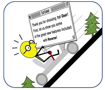
Figure 2.1 Interfaces link people with the complex workings of
machines. Simple interfaces that give users control of one thing, such
as the gear shift in a car, are relatively easy to grasp. Be aware, however,
that the simpler the interface, the more noticeable its failure to live
up to the user's expectations will be.
Fig 3-6 The size and shape of real world control points buttons,
switches even archaic dial holes are based on the size of a finger tip.
This may explain why virtual buttons tend to convey usability best when
they adhere to a narrow range of shapes and sizes. Note that fingers have
an avatar in the computer: the cursor, which determines the minimum sizes
for links and buttons. Fig 3-6b This grid shows the relative range of
shapes that feel best as buttons without the aid of common affordances
like beveled edges. The more static obtuse shapes seem to work better
than say, a triangle. A hexagon, for instance, relates better to round,
real-world buttons such as elevator buttons, whereas triangles have a
stronger association with alert symbols and signs.

Phases of Visual Cognition
When designing icons, be mindful of the phases of visual cognition. People
first recognize an object's basic geometry. Then they take in its subtler
shapes, shadows and details. Finally, they recognize its unique and defining
characteristics. Facial characteristics, for example, are registered most
quickly when they are more geometric. People notice eyes quickly because
they are round, whereas the more complex mouth shape is recognized later.
(See Figure 5.18) An icon's essential characteristics should be rendered
as simply and geometrically as possible to help the user quickly recognize
it.
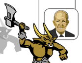
Figure 4.15 Part of Dwight Eisenhower's appeal to the electorate
of the 50's was his resemblance to Everyman. If I was confronted in a
dark alley by the ghost of Dwight Eisenhower, I would turn and run after
maybe 3 seconds - the amount of time it would take me to recognize him. But
I'd turn and run in a nanosecond of seeing the Minotaur, whom I would
never mistake for Dwight Everyman.
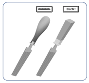
Affordances
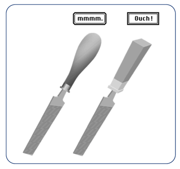
The rounded corner keyline border in the Macintosh style conveys usability
abstractly by referencing a user's tactile sense (consider the cursor
a virtual finger). The curved handle of the tool on the left looks more
user-friendly than its hard-edged counterpart on the right.
Figure 4.17 Affordances that are native to the computer still draw
upon real world experience, but more abstractly than 3-D modeling does.
The original Macintosh interface relied on abstract systems of affordances
that required an initial learning curve, but were essentially grounded
in common sense.
Antialiasing and Readability
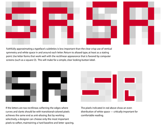
c. A letter can't be moved less than the width of one pixel. Anti-aliasing
implies a fraction of a pixel by using a combination of shaded pixels.
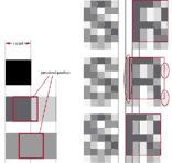 
Faithfully approximating a typeface's subtleties is less important than
the clear crisp use of vertical symmetry and white space in and around
each letter. Return to aliased type, at least as a starting point. Use
rectilinear letterforms that take advantage of the computer screen's square
and sharp pixel edges to make a simple, clear-looking button label. e.
If the letters are too jagged or flat, softening curves and slanted edge
with transitional-colored pixels achieves the same end as anti-aliasing.
But by working selectively, a designer can choose only the most important
pixels to soften, maintaining a hard baseline and letter spacing. f. The
pixels indicated in red above show an even distribution of white space
- critically important for comfortable reading.
Form
Elements
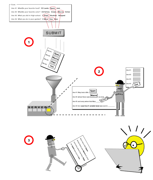
Figure 5.1 Form elements are essentially lists of options. When the
user selects an option and clicks the submit button, the information is
sent to a script, which often resides on a server but can also reside
on the client side. 2. The script then translates the information into
a useful format, 3. and often delivers it back to the user.
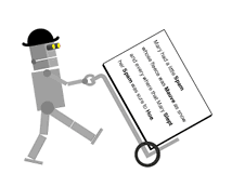
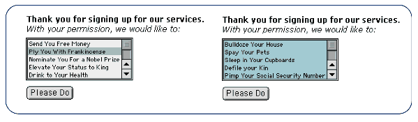
Figure 5.21 When a user selects an option, the row is highlighted.
The color of the highlight can be customized by the user in both the Windows
and Mac operating systems .
This menu has a background applied to it with CSS which is similar to
the highlight color. It appears as if every option in the list is selected,
when in fact, none are.
Metaphor & Iconography
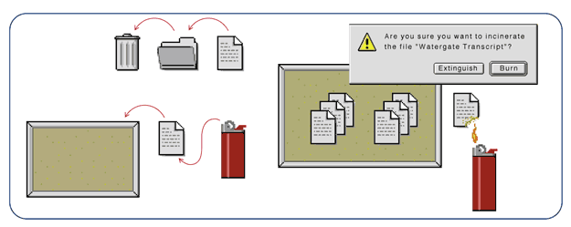
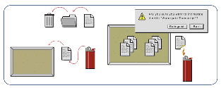
Figure 10-3 The operating system would still function if other,
equally-familiar metaphors were introduced, but the system would cease
to be elegant. Documents can be placed on a bulletin board, for instance,
and deleted by fire, but mixing concepts makes the relationship between
elements more complex, and degrades the desktop concept. End sidebar 10-3
While illustrating a metaphor through interface elements helps support
the user's mental model, over-illustration can be distracting. Strict
illustration can make the user too conscious of the metaphor. (See Figure
10-4) Fig. 10-4 Element design should support the metaphorical system
without interfering with the task at hand. Overly-illustrative icons draw
too much attention to themselves, making it harder for the user to forgive
an interface's inability to duplicate reality.
Physical Space vs. Virtual Space
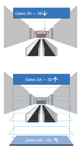
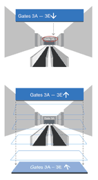
Figure 7.6 This airport directional sign is literally accurate, as
the arrow points to the destination, but it is incorrect in mapping movement
in real space. People seem to naturally interpret the sign as if it were
lying on the floor.
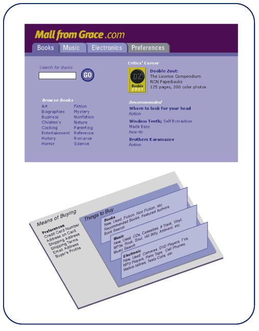
Tabs
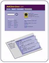
Figure 7.10: Tabs as Content Filters While none of these
four tabs are strictly related to each other, three of the tabs - Books,
Music, Electronics ‹are purchase categories. Even at a glance, "Preferences˛
does not belong in a group with Books, Music, and Electronics. Preferences
affect all purchases, and thus arch over every category, so they should
be represented in another way. Separate the tasks of defining preferences
and profiles (which will affect every purchase) from the actual item categories.
Fig. 10-15b This logical model shows Books, Music, and Electronics (things
to purchase) as parallel planes, and Preferences, which affects every
purchase as a plane that touches the others.
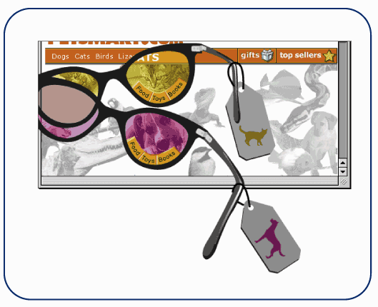
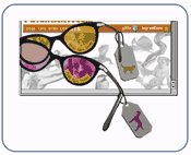
Holding a set of magic content lenses up to the page helps illustrate
what parts of the interface should be placed behind tabs, and what part
should be independent of the tabs. Good lenses exclude everything that
is irrelevant to the item you want. Here, a dog lens filters out bird
and cat items. Any links to sections that are relative to all categories
should not be filtered out, and therefore would be accessible with each
tab. Links that are not part of any content category should be displayed
separate from the tab set, because they represent an entirely separate
mode of user interaction.
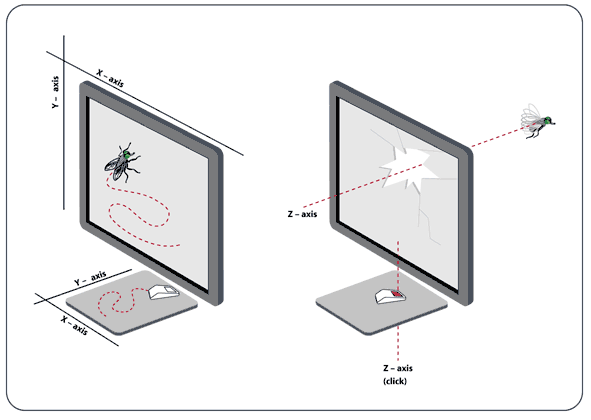
3-D Interaction
Figure 9.11 Panning limits the user to movement on one plane, up,
down, left, and right like a fly stuck on a window. To access the 3rd
dimension, the mouse click, which was once reserved for executing tasks,
can represent movement "into˛ the depth of an interface, breaking the
limits of the flat space.
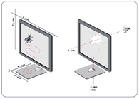
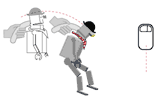
Figure 9.14 Immersed in a 3-D environment, navigation requires
a unique combination of mouse behaviors. Side-to-side movement makes use
of panning, while up and down movement uses tracking. This seemingly contradictory
behavior makes physical sense, because the mouse handles like a puppet.
Swiveling the mouse to the left to view the left side of a room is like
swinging the puppet's head left, while pushing the puppet forward faces
it downward. A forward push of the mouse is the right physical action
for angling the view downward, even though the cursor will move up as
a result.
|